Mally's News, Social Buzz
Mally Skok Redecorates an East Village Apartment
The Gallery Wall in This East Village Apartment Is Actual Goals
Wait until you see the powder room.
By Anna Kocharian
Originallty published (via Domino) on December 10, 2018 | Photography by Cody Guilfoyle
When Gabriella Skok moved into her newly constructed East Village apartment, she had only one person in mind when it came to the redesign: her mom.
The open layout of the two-bedroom apartment called for a thoughtfully curated approach. With the living area, dining room, and kitchen located in the same general zone, it was crucial to create a sense of cohesiveness between the three without the loss of individuality.
It’s rare that we come across a space designed by a mother-daughter duo, but it’s even rarer that we come across one that manages to seamlessly combine both of their stylistic preferences. And yet when Gaby joined forces with her interior designer mom, Mally Skok, it worked.
The result was an amalgamation of the duo’s respective aesthetics: Gaby’s moody, modern style combined with Mally’s eclectically colorful one that drew on her South African roots.
But don’t let us spoil the fun—read on to discover the inspiration behind the redesign and the storied pieces that give the apartment its unique edge.
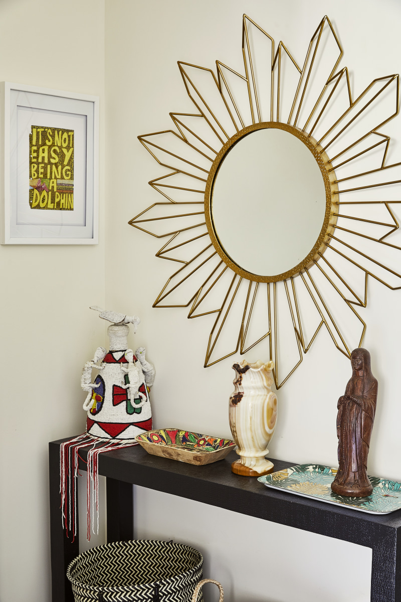
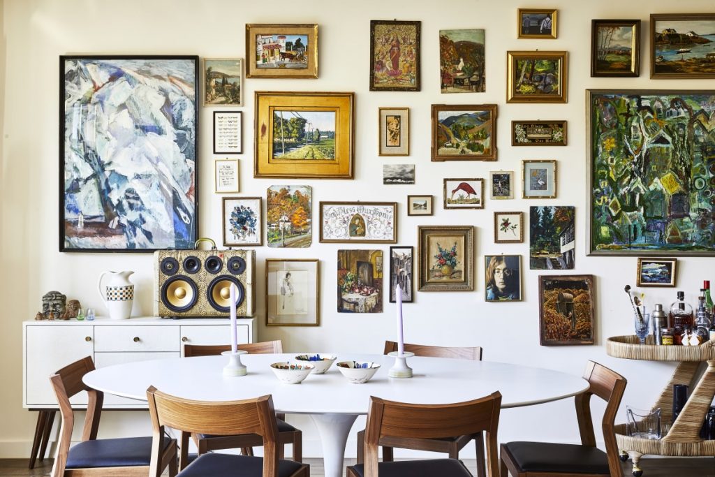
Given the duo’s avid passion for scouring vintage shops and flea markets, many of the pieces in the apartment have a backstory. The spanning gallery wall that comprises the backdrop of the dining area is the undisputed focal point of the apartment, which is quite a feat when you consider the abundance of patterns and colors.
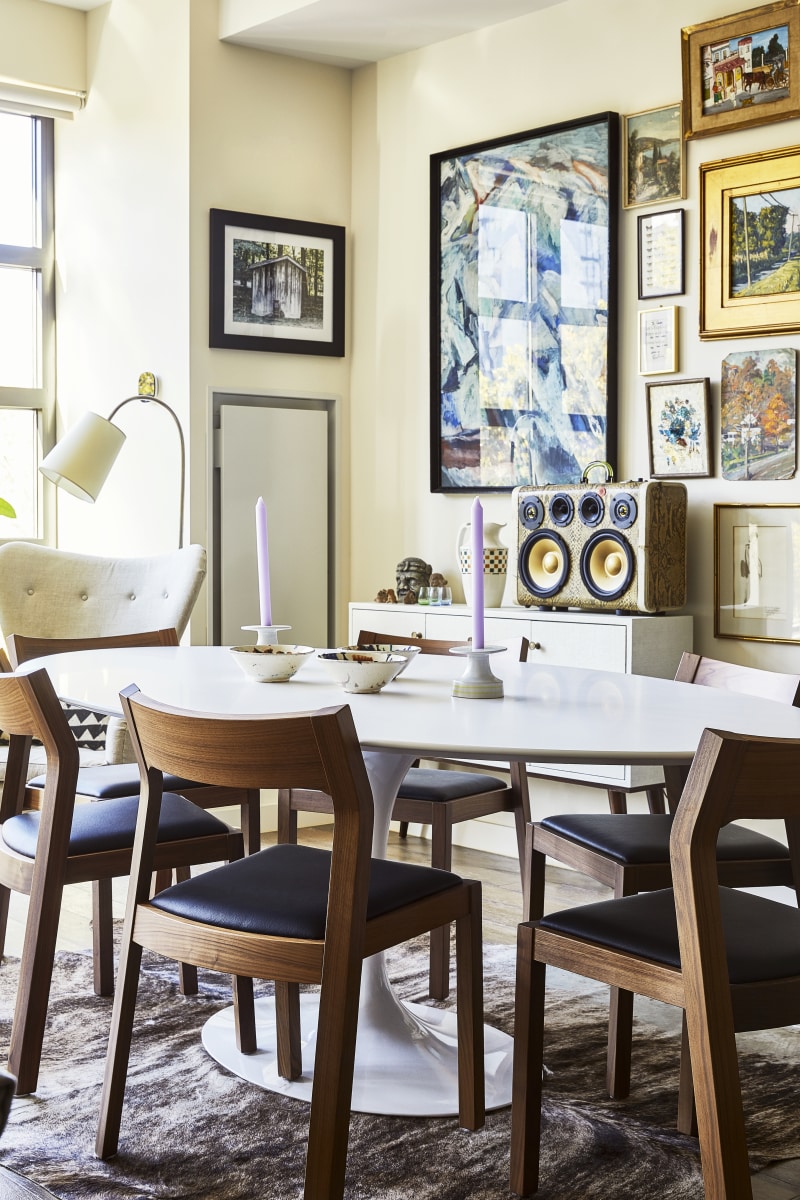
The art was gathered over time, sourced from the duo’s many vintage treasure-hunting trips to New Bedford, Massachusetts, antique emporiums in Cape Cod, and junk shops in NYC. But there was no rhyme or reason involved here, nor was there an element of curation—the scene, as Mally describes, was merely to be “a melange of the unexpected.”
“We have one or two strange places that we go strolling through and we just started buying the pieces,” recalls Mally. “[Gaby] would encourage me to buy the $75 oil painting that was done by someone’s uncle.”

Once the basic layout of the apartment was completed, Gaby designated the space behind the dining table as the start of the art wall and from the small bunch she began with, it eventually expanded to the vibrant scene we now see. Look closely and you’ll notice the subtle imperfections of the setup—pieces intentionally left crooked to instill that unique element of character.
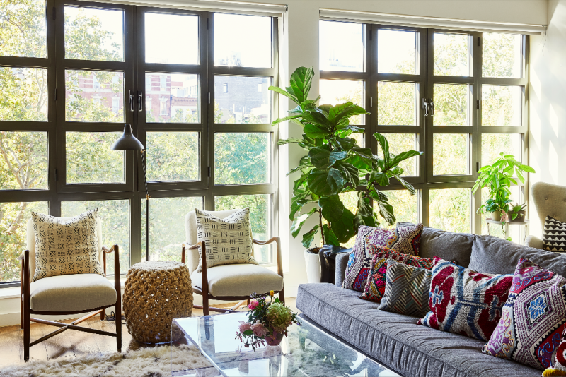
Serving as a natural complement to the captivating gallery wall, the adjoining living area came brimming with an equally diverse array of pattern-heavy textiles and a saturated splash of color.

The gray sofa serves as a neutral base for the eclectic slew of patterns that would ensue by way of the pillows and throws. The textiles—some of which Mally designed herself—pay tribute to the designer’s heritage and travels. The pillows were sourced from a souk in Marrakech, along with a Moroccan wedding blanket the duo picked up from a recent trip there.
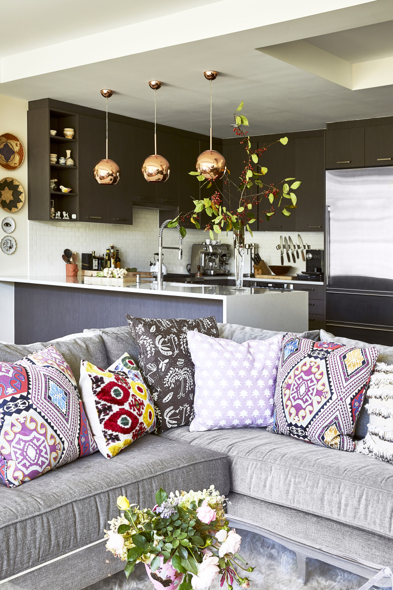
Given that entertaining is a big component of their lives, designing a space that would be conducive to parties and gatherings was an element for the duo to keep top of mind. “We wanted to maintain the coziness of the seating area—it’s a good entertaining space, which is unusual for New York,” notes Mally of the apartment’s open flow. “You can just put everything out on the kitchen counter, which is great when we’re hosting.”
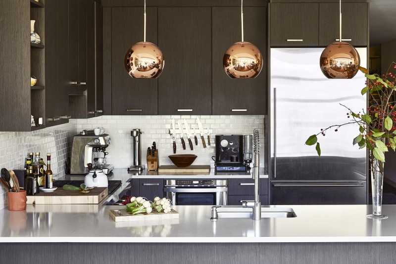
While few changes were done in the kitchen—given how new the apartment was—Mally did opt to swap the existing pendants for a more lustrous copper set. “We specially chose the apartment because we liked the vibes. The simple oak cabinets and floors throughout the space were in ideal condition. Why fix it if it doesn’t need to be fixed?”
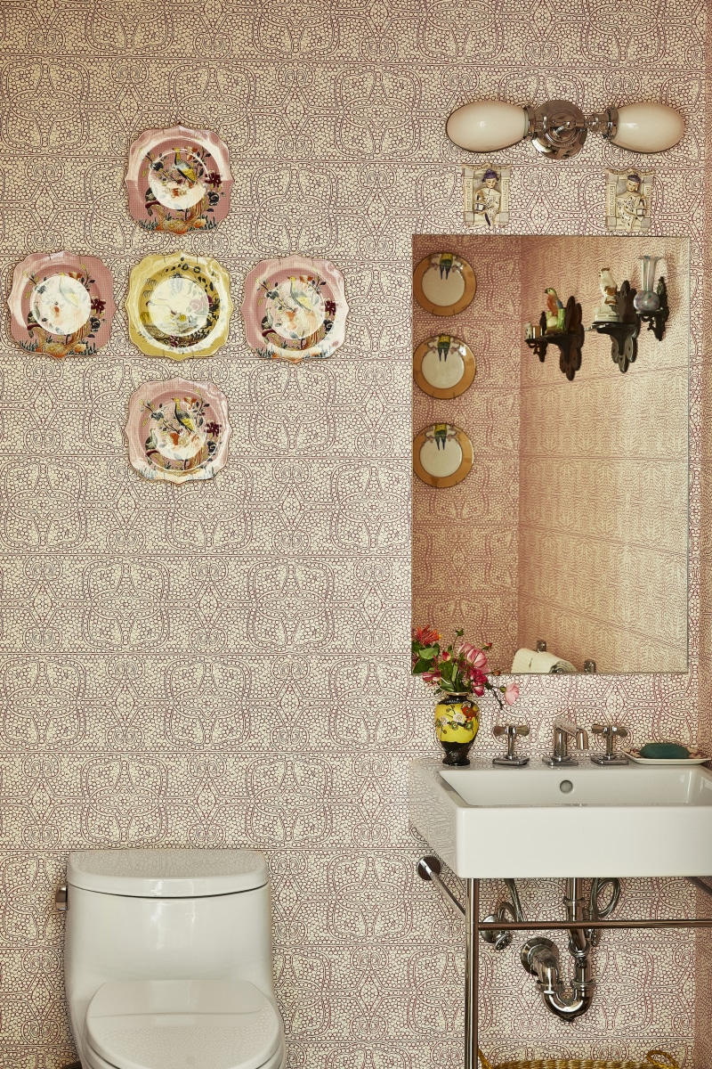
As for one of the more statement-worthy spots in the home, the powder room might just take the cake. Described as “a journey,” the Quadrille wallpaper comes paired with Gaby’s collection of antique glass plates, resulting in quite a whimsical scene. “It’s a nice departure from the rest of the aesthetic of the apartment,” says Mally, “it’s like a fantasy world when you step inside.”
Continuing on with the pink theme, Gaby’s bedroom incorporates the hue in all its glory, complemented by a handful of vintage treasures to give the trendy hue a unique perspective.
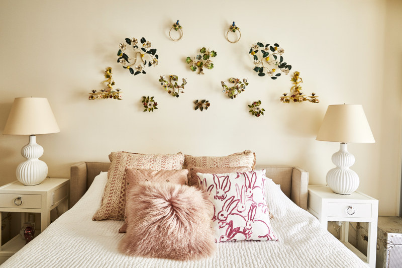
Above the bed, you’ll find an array of candle holders from Gaby’s personal collection—one which she began while in college. The 1950s botanical motif of the Italian candle holders is intricate in detail, delightfully whimsical, and decidedly unexpected—providing the otherwise monochromatic room with a bold dose of texture and visual depth.

“Millennials are a huge influence in the design world because they don’t care about the rules,” notes Mally. “It’s made the rest of the design world wake up. You can buy something from Craigslist and mix it with something your mother gave you.”
Gaby’s apartment could not be a more fitting personification of that.

