Social Buzz
Mally Skok in House Beautiful – This Granny-Chic Design Trend Is Back With a Next Gen Spin
Learn all about allover pattern decorating, the Grandmillenial design trend that makes matchy-matchy design cool and super easy to recreate.
Why This Design Look Your Grandparents Probably Loved Is Due for a Comeback
It’s a classic for a reason.
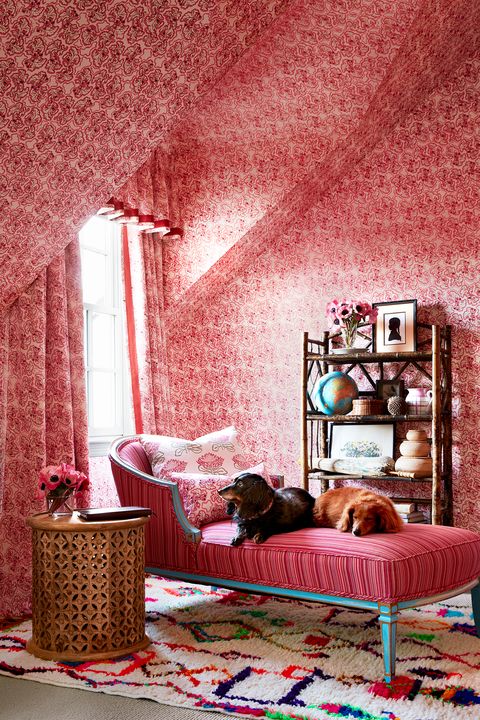
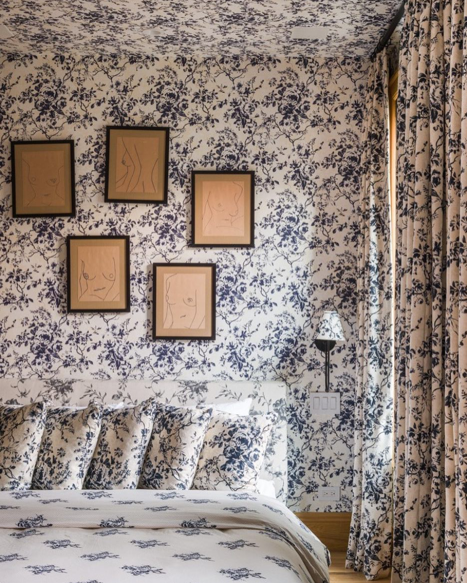
Our latest trend obsession isn’t really a trend at all… In fact, much like a recently-revived obsession with old-school wallpaper, it’s so tried-and-true that it’s sort of the anti-trendy trend. Presenting: Allover pattern, a.k.a. “matchy-matchy decorating,” a.k.a, applying one (typically dainty and small-scaled) pattern to multiple pieces in a single room, whether it’s on lampshades, walls, bedding, headboards, a sofa, curtains, or the carpet.

The look is mostly associated with preppy interiors and traditional all-American design geniuses like Sister Parish, Dorothy Draper, and Albert Hadley. But allover pattern stems back to 18th-century European decorating, when more elaborate interiors full of intricate details and intentional coordinating really took off. As is the case with most trends, today’s best designers are bringing it back in both old-school and forward-thinking applications. Whatever the style backdrop, an all-over pattern approach always guarantees cohesion—it’s a classic for a reason.
Though we love it in any context, allover pattern decorating is especially appealing to anyone who loves color and print but feels a little shy about going full maximalist with mixed pattern and prefers to repurpose the classics. This is because while it’s super bold and colorful, the repetition is less visually chaotic than other maximalist trends. The repeated use of the same pattern creates continuity; while the treatment can come across as dramatic, the camouflaging effect it creates manages to be both relaxing and dynamic. It’s also just about the easiest design statement you can make as far as pattern selection goes.
The style also has a transportation quality: you really feel like you’re inside a jewel box when you step inside a room with coordinated print pieces. Depending on the print, it can feel like “the garden spills into [the] room,” as John Fowler of Colefax and Fowler famously said of chintz, including his own iconic Bowood design.
Not only is it visually calming, but it’s also rhythmic. “Matching the upholstery to the curtains is so old-fashioned, and even more so when it’s a classic floral. But the fact is; it’s pretty and it’s cozy, and that combination wins,” confirms Chloe Werner of Redmond Aldrich Design, a San Francisco-based firm. There’s a certain nostalgia to it as well, whether it’s a nod to your childhood home, grandmother’s living room, or a historic hotel.
When working with allover pattern, you can create sharpness and differentiation with details like trim, piping, and tassels. And, like most trends, you can experiment with it on a scale from full-fledged commitment to just trying it out. Discover some of our favorite examples of the allover pattern design in the wild, from most to least matchy-matchy.
CONTINUE READING ON HOUSE BEAUTIFUL
